Sharing & Exporting images in Lightroom Classic CC

Sharing & Exporting images in Lightroom Classic CC

Sharing & Exporting images in Lightroom Classic CC

Why do we need to export?

We’ve mentioned before, in our fast guide to getting started in Lightroom Classic CC, that Lightroom is a nondestructive editor. This means all the edits you make to your photos in Lightroom, aren’t made to the actual image file. The original image stays the same and Lightroom “overlays” the changes like a filter. 

So, once you have your photo looking hunky dory you’ll need to export the image to a new file with all the changes built in, otherwise, all other programs and apps won’t see the changes.  While Lightroom makes it as easy as pie, it’s not a one size fits all step, the hard part is knowing what the optimal settings are for your use.  

Image files can be tricky, and depending on what you want to do with your photo, exporting it in the right format will make ALL the difference. Seriously – just trying to print a poster of an image that is optimised for the web will give you a weird pixelated result with slightly odd colour to boot!. Even in reverse it’s not great, using a image optimised for printing large on the web doesn’t work, you’ll either crash your site or email with slow load times – or the image will look odd and soft as the web attempts to crunch it.

So size does matter after all!

There’s an ideal size, colour space, file type and more for every purpose.  Facebook, Instagram, emailing, the web, prints of various sizes and different media. The best image file for each purpose will be different.

If this makes you want to scream and pull your hair out – don’t – you can set all these ideal settings up once and save them in the present manager and you never have to think of them again.  Ever!! 

Even better – you can grab my FREE Lightroom export presets and be ready to rock and roll in a jiffy!

Why size and settings matter

Colour space

Colour spaces in digital editing and printing are crucial.  Colour spaces are like ” secret codes” telling a printer or screen how to display your image.  Unfortunately, understanding colour spaces is tricky, it can be really hard to get a handle on. 

The good news is, for basic editing you don’t need to know anything other than which space you need to use.  If you decide later on to become a master printer or fine art editor then it can be worth reading up on colour spaces

Until then, here’s a really good rule of thumb that works every time!

Always use sRGB for web – that includes email and social sharing. 

Use either sRGB or AdobeRGB 1998 for printing (ask your print lab which is best)

That’s all you need to know about colour spaces.

Size

Does size really matter? In photography, the answer is a resounding yes! Whether it’s for print or for the web, getting the right overall pixel size for the output will make the difference between your image being soft, pixelated and blurry, or sharp and smooth.

The confusing part is that the right size changes depending on both the overall size and the application.  For example, an image that will be displayed on a screen at 5×7” and an image to be printed 5×7” will be different file sizes.

The good news is Lightroom can be set up so you don’t need to understand all the intricacies of file size optimisation to get the right result. You can create “presets” and export your images in just the right format in a single click.

Even better, you don’t even have to set up the export presets yourself – I’m sharing mine with you. For Free! Download and install these presets, choose your desired output and boom! You’re done. Presets are the ultimate time savers.

Exporting in Lightroom Classic CC

Let’s go through the two most common exports together.  Step-by-step.  Together we will export two versions of an image, one that’s perfect for Facebook and one that’s perfect to print at 5×7″.  

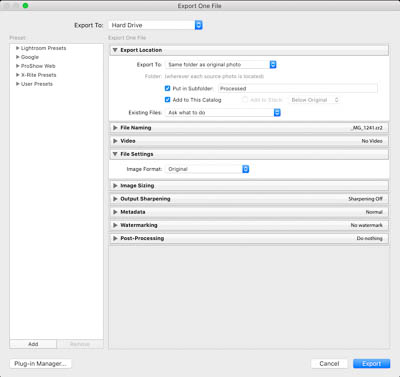
Exporting is done in the library module of Lightroom.  Simply select the images you want to export, and click “Export” in the bottom left-hand corner and the export panel will then pop up.

Facebook

Let’s start with creating an image optimised to look fantabulous on Facebook.  What? fantabulous is a word!  

Here are the settings you need to look at.

Export location

As a default, I like to select choose folder later.  (You can choose the same folder as the original, however, you’ll quickly end up with a lot of images and no idea which was meant to be for what!).

When you press export (after completing all the settings below), Lightroom will then ask you where to put the file.  I recommend either in a subfolder named “facebook” or having a folder on your desktop for all your Facebook images.  This way you can regularly clean it out without clogging up your hard drive.

File naming 

Leave as is.

File settings 

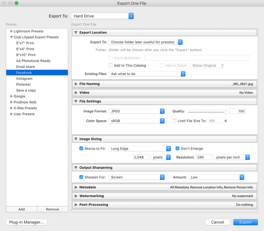
Facebook likes jpeg images, in sRGB at a quality of 100. 

Image sizing:

Resize to fit the long edge.  This is key as not every image will exactly match facebooks dimensions.  The import thing is to have the longest edge the correct size and the rest will look after itself. Facebook currently recommends 2048 pixels at 240 pixels per inch for best quality.

Output sharpening. 

Sharpen for screen, standard.

Timesaver tip – at this point click “add” in the bottom left-hand corner to save these settings as a preset.  Give it a name you’ll remember – like “Facebook”.  Next time simply choose it from the dropdown list on the left. No need to remember a thing!

Click export – select your folder for the final image – and you’re done!
Export to print at 6×4” and rename

These are the best settings to export prints to be printed at 6×4”.  I’ve set the preset to save to a new folder on the desk top called “Print”.  And renamed the file to be “6×4 print [original file name]”. Handy for uploading to your local print lab!

Export location

Choose Export to Desktop

Check “Put in Subfolder” and type Print – this will create a new folder called “Print” on your desktop.  I also select “add to catalog” so I can review the exported images in Lightroom.

File naming:  Check  “Rename To” and select “Custom Name – Original File Number”.  In “Custom Text” Type “6×4 print”.  Below this field, you will see a preview of the new file name. 

File settings

JPEG at a quality of 80 – Reducing the quality to 80 has no material effect on print quality and but will reduce the size of the file you need to upload.  This is really helpful for upload times and data usage. I use a pro-lab that prefers files in AdobeRGB.  Ask your lab what they prefer and select that option.  Consumer labs mostly prefer sRGB.

Image sizing

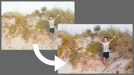
Resize to fit the long edge.  Note – make sure your images have been cropped to the same aspect ratio as what you plan to print otherwise you might loose parts of an image or end up with white space. The image below is cropped to the aspect ratio of 5×7.  Printed at 6×4, parts of the image will be cropped off or it will print with spaces on the side.

Choose 6 and inches, at a resolution of 300ppi.  I also check “Don’t enlarge” as most original images will be at least this big.  And if not, most images print perfectly at resolutions as low at 200dpi.  Enlarging an image unnecessarily could result in a fuzzy image.

Output sharpening  

Glossy paper and low.  Of course, if you are using matt paper – choose this instead.  If you find you are a “heavy” sharpener in Lightroom, don’t sharpen at this step at all.

Timesaver tip – at this point click “add” in the bottom left-hand corner to save these settings as a preset.  Give it a name you’ll remember – like 6×4 print.  Next time simply choose it from the dropdown list on the left. No need to remember a thing!

Click export – select your folder for the final image – and you’re done!

Lightroom Classic CC Clean Edit – Start to Finish

Lightroom Classic CC Clean Edit – Start to Finish

Lightroom Classic CC Clean Edit – Start to Finish

What is a “clean edit”?

“Clean Edit” is a term you hear a lot in photography circles, thankfully we aren’t talking about household chores, you can do a clean edit when your desk is in a complete shambles, just as you can clean edit a picture of your kids bedroom/rubbish tip!  A clean edit simply means, editing the image so that it looks pretty much how your eyes saw it when you took the photo.  No extra filters or funky colour effects and keeping the image relatively true to life.  Perfect for child photography!

As you grow in your photography journey you might find yourself at times drawn to a particular style, like matt finish, B&W, vivid colour or even grunge. Particular editing styles go in and out of fashion and while fun, keep in mind that you can end up dating your photos if effects are used with too heavy a hand.  I find most of the time a clean edit produces the most timeless effect, one that doesn’t have me cringing in years to come! 

Let’s jump in and get started!

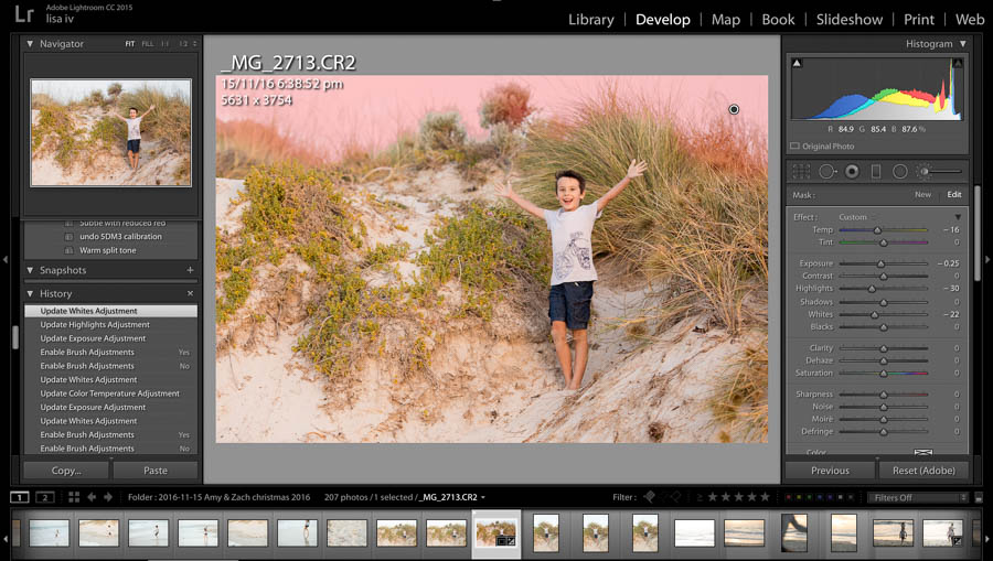
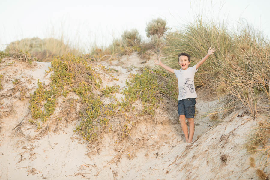
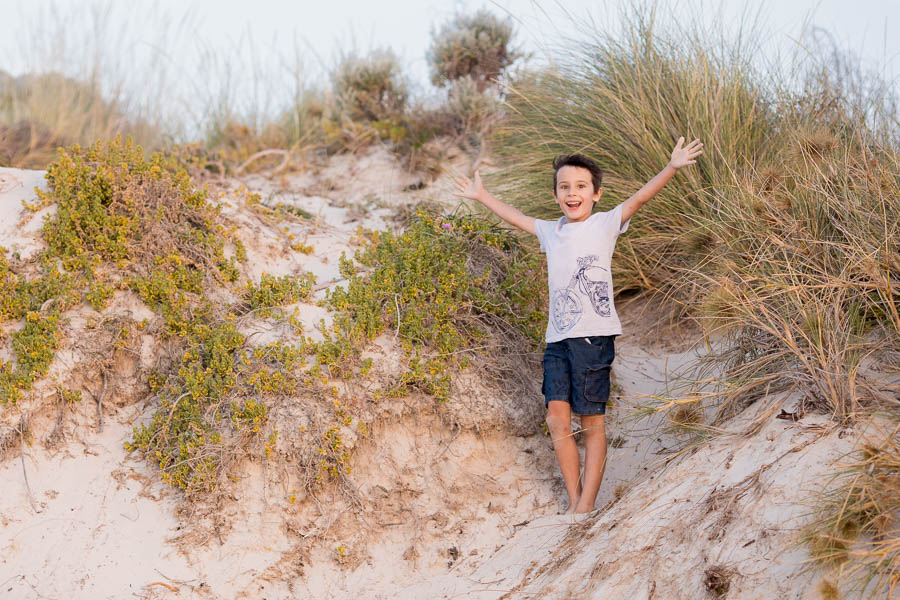
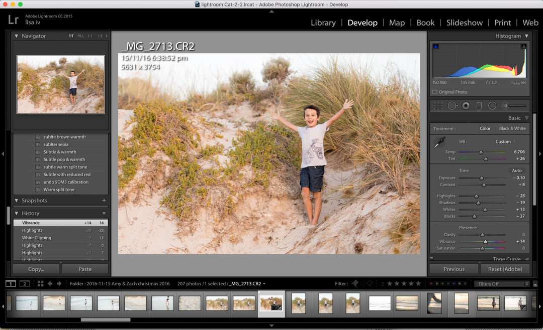
I’ve chosen this image of my son on a sand dune, it was taken just before sunset – on a fizzer of a sunset day – so colour in the sky was pretty non-existent.  I could do a funky edit and “fake” an amazing sunset, but then this wouldn’t be a “clean edit” tutorial, yes?

When editing in Lightroom, I always work through the tool palates from top to bottom. Not only is it a nice logical workflow, it produces great results.

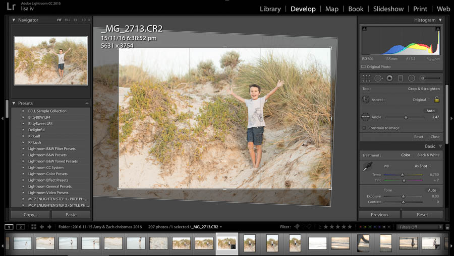
Step 1 | Crop & straighten

First up, I like to crop and straighten the image.  I don’t know about you, but I can never take a straight image!

Because this image has sand dunes of a horizon it’s not so bad, but I still grab the crop tool and then the ruler and make a slight adjustment.  Then crop in a little using the “rule of thirds guides”  so that the composition feels better.

Step 2 | Basic edits / global adjustments

Next up is the basics panel, and again I work through this panel from top to bottom.

White balance

You can get very strict with white balance, using all sorts of measurement tools and scientific formula’s if you want to.  But who has that kind of time?  Even with a clean edit, it’s ok to interpret the image to suit your preferences making it slightly warmer or cooler than “strictly” accurate on the day.  I usually start with auto or as shot, then choose my preference, my tastes generally run to a little warmer.

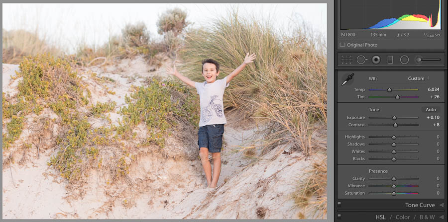
Straight out of camera this image felt a little green and cool, so I’ve bumped the temp and tint up a touch.

Exposure

The image is quite bright, but a beach is! So I’ve only brought it down just a smidge.

Contrast

I don’t like to add a lot of contrast with this slider, and sometimes I don’t even use it.  More subtle and targeted contrast can be achieved with the next section.  In this image, I go for +8.

Highlights / shadows / whites / blacks

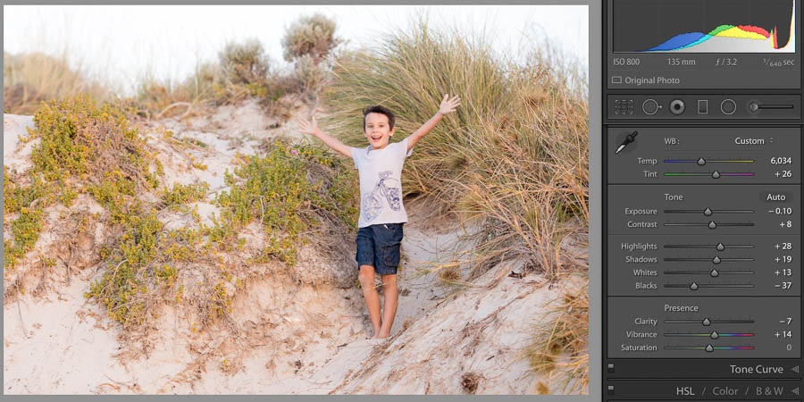
When adjusting these you need to look at your image analytically, ask yourself, do the lightest parts look to bright? The darkest to black and lacking in detail? Overall is it a little flat, with no real highlight or shadow? And adjust accordingly. This shot, is a little flat, with no real highlights or shadows and could do with a little more punch.

I bring the highlights down -28 to give a bit more definition to the sky and the grasses.  Shadows to -19 and whites up to +13 and the blacks to -37 a fair amount to really add that punch.

Clarity

I reduce the clarity a little to slightly take the edge of the grasses and increased the vibrance a touch.

Tone curve

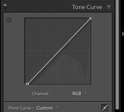
I’ve slightly darkened the shadows by bringing the bottom left across a fraction.

LIghtroom CC tone curve adjustment

For beginners, we can skip over the HSL/Colour/B&W, and split toning panels.

Step 3 | Sharpen

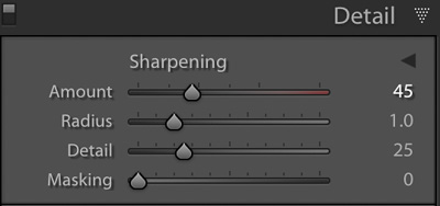
In the detail panel, zoomed into 100% I move the amount up to 43. I can’t see any noise or other issues so leave the rest as it is.

Step 4 | Advanced / local Adjustments

Now I jump down to the effects panel. 

Vignette

Often I’ll add a very subtle, soft edged vignette to an image, to draw your eye to the subject. This image, however, works better with out a vignette so I’ve left this alone.

Remove an object

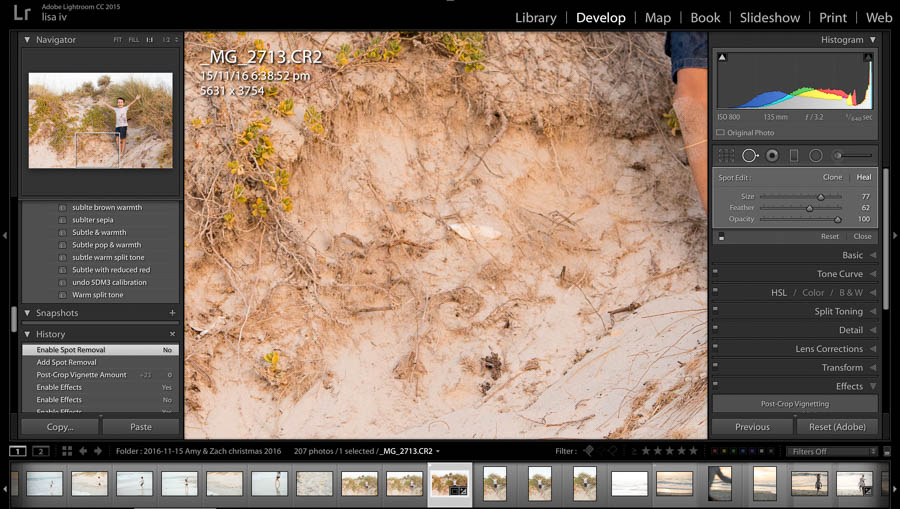
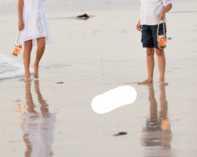
Just because it’s a clean edit, it doesn’t mean you can’t clean it up a little.  I’m not in love with the cuttle fish on the sand – it looks more like rubbish – so I’ve removed it using the spot removal tool.

photography how to

Selective dodge or burn

Lastly, I look to see if any parts of the image could do with a selective lightening or darkening.  Often the sky can needs to be darkened a little to reflect the colour on the day – unfortunately because the sunset was a real fizzer on this day, there’s not much that can be done with this sky so I just pull it back a little with the brush tool.

Lastly – I always take a look at the image and see if there is anything I want to change or tweak now I’ve finished all my edits.  Remember when editing less is more!  It’s really easy to go to far and end up with a weird pop art looking number. 

And that’s it!  Here’s the before and after with a clean Lightroom edit.

photography how to

Some of the links in this post are affiliate links, however, be assured I only ever recommend products or services I personally use and love.

The Top Four Lightroom Classic CC Edits

The Top Four Lightroom Classic CC Edits

The Top Four Lightroom Classic CC Edits

I’ve put together the top 4 Lightroom Classic CC quick edits you’ll use over and over and over!  They might be small, but mastering these four fixes,  will have a BIG impact on your photos!

I remember when I first started using Lightroom.  I got the basics of Lightroom sorted. I managed to import a photo, checked out the library module and had a play with the develop module. Then I started to get really excited about the potential of what it could do. I even sort of “got” what each of the basic sliders did. 

But actually processing an image so it looked good? 

Not a chance. 

If I’m honest, finding the right mix of adjustments seemed to elude me and most of my photos ended up looking like a cross between a 70’s cartoon strip and futuristic hologram!!

Eventually, I worked out the key was not trying to do everything at once. Instead, if I simply worked on fixing one or two problems with a photo at a time rather than jumping in and trying to take a photo from “zero” to “hero”.  

So where to start?  What top fixes or edits should you master first?  I’ve got your back. 

1 | Global Exposure fix in Lightroom Classic CC

Let me let you in on a little secret! Even professional photographers don’t always nail our exposure in camera.  Say, for example, I’m shooting in natural light on a cloudy day and the sun comes out from behind a cloud, I might not adjust my exposure fast enough and end up with overexposed images.  Or, my favourite stuff up, I bump a dial (yep, that happens) and it’s a few frames before I notice and I end up with an under exposed or over exposed image.  A lot of the time, you can still save the image – and Lightroom is the business for fixing exposure in a snap.

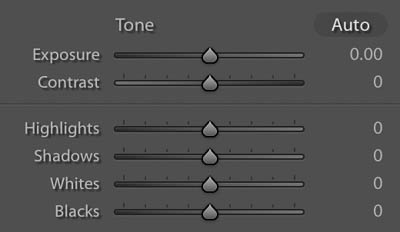
Exposure issues are fixed easily in the basics panel using these five sliders – The best way to understand how these will work is to have a play, open an image and move take turns moving each slider to the far right and far left and watch what changes in your image.

Lightroom exposure sliders

Exposure

This slider makes a global adjustment across the whole image brightening or darkening every part of the photo. It’s the best place to start. Slide it right to brighten and left to darken until the image mostly looks right.

Highlights

Next look at the brightest parts of the image, you can selectively lighten or darkened them with this slider. 

Keep an eye on the photo – the aim is to bring in a little detail in the highlights if darkening or brighten to add contrast.  Be like Goldilocks and aim for just right.  Darken the highlights too much and you might “block it up” where it becomes a splodgy spot, too light and they might become white glowing splotches!

Shadows

The shadow slider will only affect the darkish parts of the image (not the blacks).  Darkening shadows can add contrast and brightening shadows can bring some needed detail into the shadows.  Just keep an eye on your image and make sure you’ve not gone too far either way, giving that weird comic book feel. 

Whites

The whites slider is the opposite to the shadows, affecting only the lightish parts of the image.  Just like the highlights you can go too far and end up with a splodgy looking image.

Blacks

The black slider is the opposite to the highlights slider and will adjust only the darkest parts of the image. 

Again keep an eye on the photo, if you brighten these too much you can get a comic book effect, to dark and your photo will be very grungy!

Another way to look at it is to imagine the image’s tones all split into four from lightest to darkest.  It’s like a sliding scale.

You won’t always adjust all four and will often go back and forth tweaking each one and the overall exposure to get the right result for the photo, in less than a minute! 

how to edit a photo
how to edit a photo

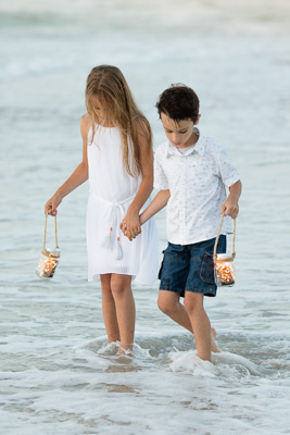
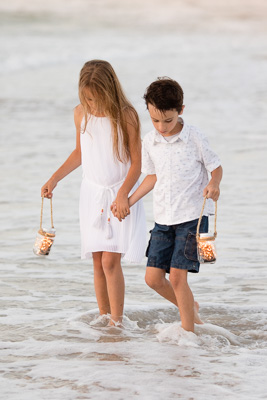
A few quick adjustments took this underexposed image to perfect!

2 | Fixing white balance in Lightroom Classic CC

White balance refers to the colour temperature or the warmth of an image.  An image with the wrong colour temperature can look really off – fortunately, it’s easily fixed in Lightroom.

Cool

Neutral

Warm

The temp and tint sliders are the key tools for correcting exposure.  These will look slightly different if you are working in raw or jpeg, and a raw image will be easier to correct, but the principle is the same.

jpeg files will have “0” as the default settings

Raw files will show the exact white balance levels shot

Temp

Move to the right and the image becomes more yellow, to the left and more blue.

Tint

Move to the right and the image becomes more magenta (pink), to the left green.

The simple fix is to adjust the sliders until the image looks right to you. I often try Auto first – sometimes it’s perfect or much closer to what I want. Colour balance can also be selective, I often “warm up” images taken in cooler light.

“Quick tip” if you have a neutral part of your image you can select the eyedropper and click it on the neutral part and Lightroom will set the white balance.  Use your judgement though, it can be affected by different lights and colour and not always work.

The image straight out of camera was too cool and green

Once the white balance is corrected the image has a much nicer feel.

3 | Removing an object in Lightroom Classic CC

We’ve all taken great photos where we wish something wasn’t there! Maybe rubbish on the grass, a toy, or a dust spot in the sky from the lens.  Heck, one of my favourite portrait locations has a sign right where people look best!!

The great news is, it’s really easy to remove objects in Lightroom – as long as you can choose an area that’s “clean” to copy from.  Wait.  What do you mean by “clean”???    Say for example you have a picture of your kids on the grass at the park, the stars aligned and they were all looking great in the one photo!!  But, there was a chip packed on the grass too close to crop out. As long as you have a section of clean grass you can remove the chip packet with a few clicks in Lightroom. 

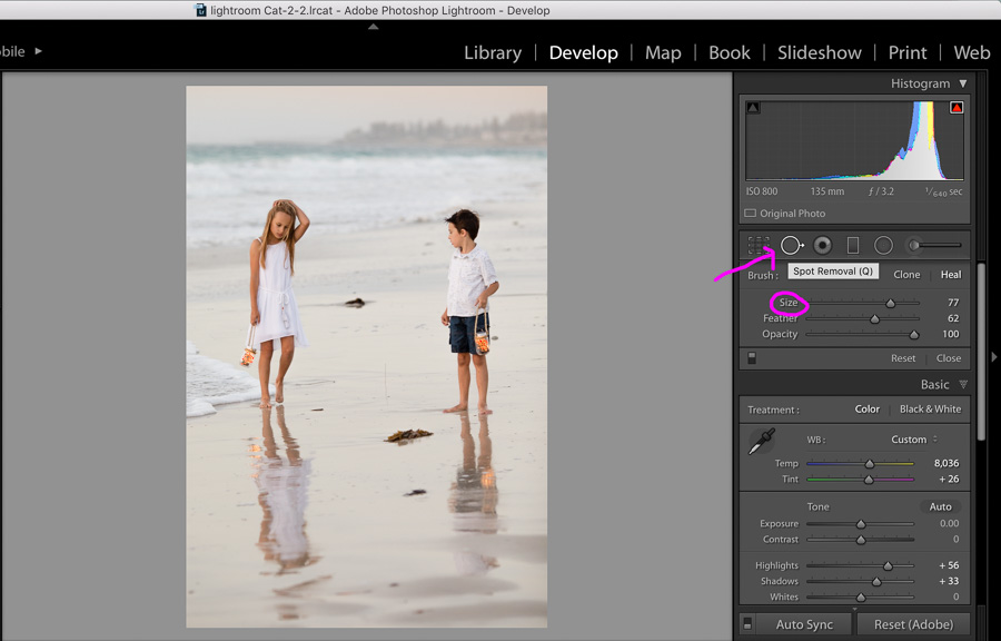
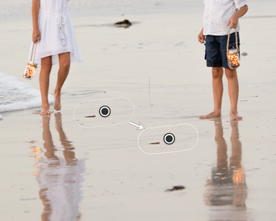
Here’s what you need to do. Open up the tools palette and click on the Spot removal tool

Open up the tools palette and click on the Spot removal tool.

Go over to the object you want to remove and colour it in (you can adjust the brush size if that’s easier) 

Lightroom will then “guess a clean spot to use to “remove the object.  If it’s guessed wrong (like I think it did here, I don’t like how it’s chosen a spot with a small rock) you can simply move it to a better spot.

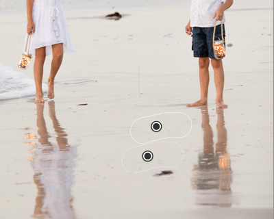
So I repositioned it to a cleaner spot.

If you want, go crazy and get rid of all the big rocks and seaweed!

And that’s it.  Unwanted objects removed!

If only decluttering my house was that simple . . . 

4 | Simple sharpening in Lightroom Classic CC

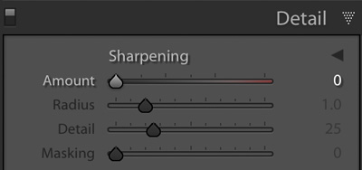
Lightroom is great for quickly sharpening your images.  Before I sharpen, I like to make sure my image is zoomed into 100% so that I can keep an eye on “noise” levels  (that grainy look), the more you sharpen, the more noise appears in an image.

Sharpening is done in the “Detail Panel” and often the default setting is often pretty good.  If you need to, you can boost it up a bit by moving the amount and the radius up little.

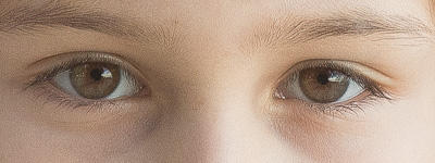
It’s hard to show online as various displays also change things, but you can see the difference here in this raw image, from unsharpened to sharpened.


While adding a little simple sharpening is easy, sharpening can be complicated and a little understanding of what’s happening can help you get the right results.  I’ll be going into sharpening in an easy to understand way in my Lightroom course that’s due for release soon 🙂

For now, I recommend having a little play with sharpening, be gentle and gentle, keep an eye out for noise and pull back if needed.  Less is often more when it comes to sharpening.  Oversharpened images have that “overcooked” look. Like this weird patterned effect!

How does JPEG Vs RAW effect sharping?

A jpeg image will actually already have some sharpening applied in camera depending on your camera and jpeg settings. So it might not need much sharping in post.  Whereas a raw image will not have any, almost all raw images will benefit from some sharpening.

Some of the links in this post are affiliate links, however, be assured I only ever recommend products or services I personally use and love.

Get started using Lightroom Classic CC – Fast!

Get started using Lightroom Classic CC – Fast!

Get started using Lightroom Classic CC – Fast!

A Crash Course in Lightroom Classic CC

Get ready for the ultimate beginner’s guide to Lightroom Classic CC!  And while I promise to get you up and editing your photos in a flash, there’s a lot to cover so you might want to go grab yourself a cuppa/glass/choccie and settle in 🙂

Already know what Lightroom is and want to jump in and get started?

Skip straight to the Lightroom Classic CC quick start guide

Lightroom can transform your images in a few simple clicks!

get started using lightroom

Why you need Lightroom?

Perhaps you’re wondering why you even need Lightroom in your life?  After all who has time to learn yet another software? Trust me, if you love photography, you’ll LOVE Lightroom. Aside from being a beautifully simple way to edit your photos, it solves many other problems frequent snappers have.

I’m betting you’re just like me! You take so many photos that your phone, camera and computer are always filled to the brim!  Pretty sunsets, nights out with friends, your kid’s funny faces, cute moments or hilarious first class tantrums and even the odd pretty cup of coffee in that gorgeous cafe where the light was just beautiful  . . . .  We’ve all done that right?

So. Many. Photos. Yet, it’s rare that you ever actually end up “doing” anything with them. Especially the ones you take on your camera that you can’t instantly share online!  With these in particular it always seems too hard to organise, edit, share or print the winners. And even thinking of putting the “phone snaps” together with the “good camera” shots to create a yearly photo book . . . that’s the definition of the too hard basket right there! 

This is why you need Lightroom, it’s not just a photo editor, it’s also a photo organiser,  a cataloguing system and a great tool to create photo slide shows and photo books all in one!

With Lightroom you can:

  • Quickly organise all your images from ALL your devices and cameras
  • Add keywords to effectively catalogue your images so you can find what you need when you need it!
  • Easily make pro level non-destructive edits to your photos.  Non-destructive is key – you can play to your heart’s content and not worry that you will destroy the original image – the changes are effectively made like a removable filter over your photo.  Once you like what you see, you can copy these edits to similar photos in one step, saving you hours!!
  • If you shoot in raw, not jpeg,[link] it’s even more important to use a raw editor, like Lightroom to “finish off your images.
  • You can also save your “recipes” you find you use over and over in presets, making it even more efficient to edit your images
  • Lightroom makes it easy to print and share your images at just the right size for every purpose.  Facebook, Instagram, a small print for Grandma.   
  • There’s even a slideshow and photo book creator built in.

Boom!  What more do you need? 🙂

Is it hard to get started in Lightroom?

So you’re sold, but I’ll be you’ve heard Lightroom is hard.  And it’s true, it can seem really confusing the first time you open it.  But it doesn’t need to be.  Working through step by step and focusing only on what you really need it’s actually pretty simple to get started.  

Lightroom has 7 “modules”, but before you break out in a cold sweat, take note that 95% of the time you’re only going to need 2 of them. The “Library” & “Develop” modules.  That’s it!  For now, put a big mental cross through the rest.

The Library Module

Just as it sounds – this is where your photos live.  It’s where yYou’ll import your images, organise and add keywords and also where you’ll export your images in the right format and size for your project.

The Develop Module

I like to call this the fun module, because hello – this is where you’ll edit your images and realise your creative vision.  Everything from basic colour & exposure correction & sharpening to B&W conversions, removing “spots” or distracting objects, bringing back skies and funky effects.

Now you know you only need to know two modules, getting started in these is a snap!

Lightroom Classic CC Quick Start Guide

Let’s bust the myth that getting started in Lightroom can be tricky and overwhelming.  It doesn’t need to be. I’ve put together four steps that will walk you through the key things you need to know to get started. Follow these and you’ll be off to a running start in no time.


Step One: Download and Set up

Step Two: Import photos

Step Three: Edit photos

Step Four: Export photos


Step One: Download and set up Lightroom Classic CC


Download

Lightroom Classic CC is available from Adobe. I recommend the Creative Cloud Photography Plan which gives you Lightroom and Photoshop for $14.29AUD or $9.95USD per months.  Excellent value even if you never end up diving into photoshop!  You’ll get access to the Lightroom desktop app for Mac and PC on up to two devices as well as companion apps like Lightroom mobile for smartphone and tablets.

Open & set up.

When you first open Lightroom Classic CC, you’ll be asked a few things. Don’t panic.  It’s really easy. Breathe and follow these instructions.

Create a catalogue

Lightroom will ask you to create a new catalogue, this is simply where it’s going to store all the information about your photos.  You can go with the default location and name, or choose your own. Don’t stress over it, the default location and name are perfectly fine. 

Creating a catalogue is something you generally only have to do once.

Now it’s time for the fun part!

Step Two: Importing & Viewing images in Lightroom Classic CC


Importing your images

Once you’ve created your catalogue, you need to import images into Lightroom for you to edit.  Even if your photos are already on your computer, Lightroom won’t be able to see them until you import them. 

You can also import directly from your camera, phone or card and when you do this you’ll also be copying your images to your computer at the same time.  Win win!

From your camera or card reader

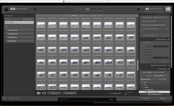
Connect your camera or card to the computer and click on Import on the bottom left of the screen.  You should see this screen with previews of the images you want to import. 

LIghtroom import screen

If you don’t, look at the folders under source on the left and make sure your card/camera is selected. 

Before you start the import – check these settings below only and don’t worry about any others.  Lightroom remembers your last import settings so you only need to do some of these things the first time you import!!

1. Make sure “copy” is selected at the top of your screen. 

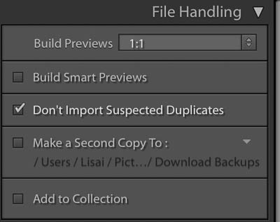
2. Set up file handling.  Lightroom needs to build previews for your images and this can take time – and take up extra hard drive space on your computer.  Choose one of the following

  • 1:1 – if you plan to work on the images very soon – it will take some time but will save you hours later. This setting will also take up the most space on your hard drive.
  • Minimal:  If you just want to back up your phone or camera and won’t look at them for a while.  This is the fastest option and takes up the least space on your hard drive.

You can also check the box “don’t import suspected duplicates”, this is especially handy when you download from a phone, camera or card that you haven’t deleted since last time.

Lightroom Import Settings

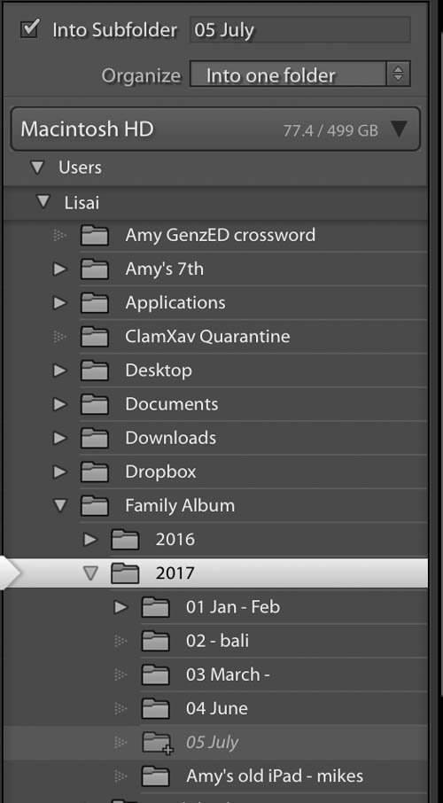
3. Choose a destination.

You need to tell Lightroom where to put your photos on your computer.  This menu is showing you the files and folders on your computer. If you don’t have a folder structure set up for your photos yet, I recommend sorting them into folders by date or month. In the example below, I’m telling Lightroom to put them in the “2017” folder and create a subfolder for this lot called “05 July”.  If you have a folder all set up on your computer, simply navigate to that folder and select it.

Lightroom CC import file management

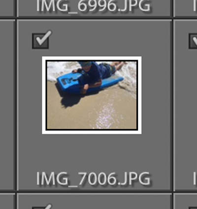
4.  Choose which images to import. 

Stay with the default select all or choose specific images by making sure they have a checkmark in the corner of the preview.    Don’t try to pick your best images at this stage – that’s where Lightroom shines!   

From your computer

To import images from already on your computer – it’s even easier! 

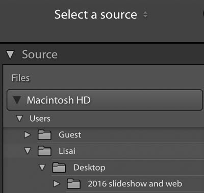
  1. Navigate to the folder under “Source” on the left then follow step 2 above.  You don’t need to choose a destination because they are already there!

Obviously there are loads of other settings you could use here – but for now, this is all you need to know.

You can now jump in and start processing your photos!

Viewing your photos!

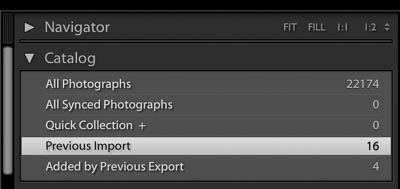
Once you’ve imported your images Lightroom sends you back to the library module, this is where you can easily sort and organise your photos, generally, you’ll be shown all the images you’ve just imported. On the top left panel under “Catalogue”, you’ll see highlighted what is being displayed.

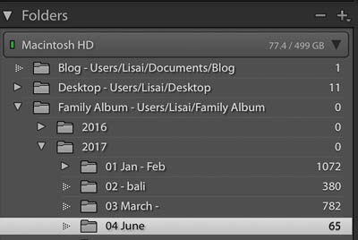
The next block down shows the folder view, just like your computers file browser. Navigate to the images you want to work on.

Now just spend a few minutes checking out the different display options. Click on all of these buttons under the image panel and see what happens – I find I learn better by just doing it 🙂

Lightroom Image display buttons

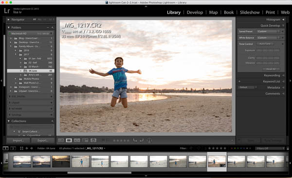
You’ll see to the left is the file browser, in the middle a photo, the bottom a film strip of your images with the selected image highlighted and to the right the quick develop panel

Lightroom Develop module

I recommend clicking on the arrow on the far right and hiding the quick develop panel. I prefer more real estate for the images 🙂

You can also zoom in to check details by pressing the spacebar or choosing 1:1 in the navigator top left.

You can do all sorts of fun things here like create collections add keywords and flag or rate images.  However, this is the quick start guide, it’s time to pick an image and get playing!

Step Three: The develop module – Editing your images

Whoop Whoop – We made it to the fun stuff!! 

Click on the develop module and your photo will now be in Lightrooms “digital dark room”.  Here you’ll be able to crop, adjust colour and exposure, make b&w’s and do local or selective adjustments to just a part of the image including getting rid of unwanted objects. 

The develop module of Lightroom is very powerful!   To learn all that it has to offer is let’s face it, way way more than I can put in one blog post which is why I’m about to release my new Lightroom Classic CC Course, to walk you step by step through everything you need to know!

It is however really easy to get started and make simple adjustments that have A LOT of impact on your image.

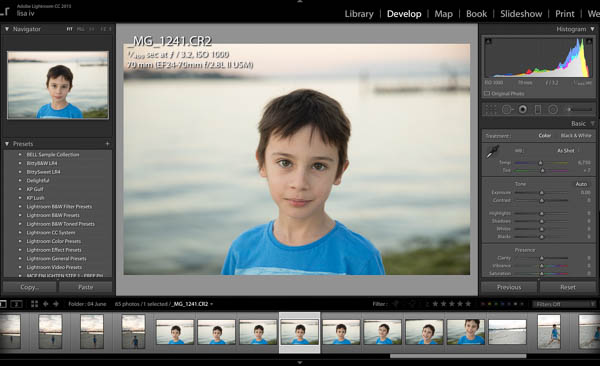
Move to the Develop module by clicking “Develop” on the top right, and this is what you should see.

LIghtroom Develop Module

On the left is the navigator and presets, the bottom the film strip and on the right the tool pallets – where all the action happens! When editing an image I work from the top down through the tool pallets. 

Straightening and cropping

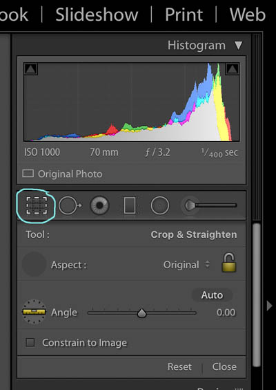
I can’t take a straight photo to save myself so I always start with straightening and cropping my image Click on the crop symbol.

Lightroom Crop Tool

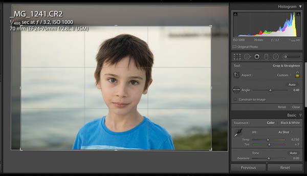
If there’s a horizon or obvious level point, choose the ruler and drag along exactly along the horizon of the image and just like magic, Lightroom will straighten your photo.  You can then click and drag the corners of the crop marks to crop to your liking.  In this image, I’ve cropped in a little.

Cropping in Lightroom

Cose the cropping tool by clicking close at the bottom and move on to the basics panel. 

The Basics Panel

Here’s where the magic happens. 

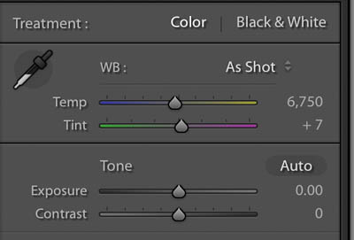
Lightroom Basics Panel

Follow the panel section in order, from top to bottom and have a play.  Move the sliders back and forth and you’ll quickly learn what each slider does.

The first sliders adjust the white balance, that is, how warm or cool the colour tone of your image is.

The second section is the tone, these sliders adjust the exposure of various parts of the image. The first two affect ALL of the image, the last four only certain tonal ranges of the image.  For example, the highlight slider lightens or darkens only the highlights (or bright bits) of the photo.

The last section is where you can change the saturation, vibrancy and the clarity (go ahead and drag out the clarity slider and watch your image go crazy).

Don’t forget, these changes are non-destructive!!  This means if you accidentally turn Aunt Mavis bright red with crazy deep wrinkles.  No problem!  You can press reset at the bottom of the tool pallets and start all over again. If you only want to go back a few steps, Lightroom has you covered! On the left is the history panel detailing all the recent changes you’ve made, click by click.  All you need to do is click on the last adjustment you want to keep.

That’s it – go have fun like a kid in a candy store – only better & guilt free!!   All the changes you are making are stored in the Lightroom catalogue and your original image is not being changed in any way.  So you can’t wreck the photo!

When you’re happy with the edits and changes you’ve made, it’s time to “export” the photo.

Step Four: Exporting images – Getting your photo’s out of Lightroom Classic CC

Exporting images in Lightroom is a little bit light using the “save as” function in other software. By exporting, you save a new copy of the image you’ve created, with all the edits, in the format and size you need.

You can export just one photo or a whole folder of photos making it a tip-top time saver – and who couldn’t do with saving time!

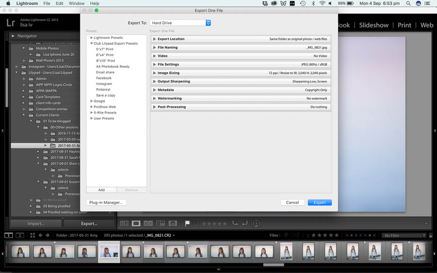
To export images, make sure you’re back in the library module, select the image or images you’d like to export and click “export” on the bottom left. The window below will pop up and you can input your “recipe” for the new file as well as choose a location for the new file(s) to be saved.  Click “Export” and you’re done!

Wait.  But what export settings should I use???

Well, it depends! The ideal settings  (size, colour space, file type etc) will vary for every purpose.  Facebook, Instagram, emailing, the web, prints of various sizes and different media will all have different optimal export settings.

Let’s start with simply saving a new copy of the image, with all the edits.  These settings below will export a copy with all the edits and no other changes (the size will be the same, filename & type the same) and put it into a new folder called “processed”.

Lightroom Export Settings

The good news is in Lightroom, you can set all these ideal settings up once and save them in the preset manager and you never have to think of them again.  Ever!! 

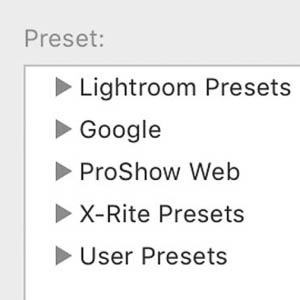
Clicking on the various presets under user presets will export an image with the exact settings you need with one click.

Want to know the right recipes that guarantee the best results for all the popular outputs – you can download my free Lightroom CC Export Presets!  All the settings for all the popular outputs already done for you! Facebook, Instagram, popular print sizes, email, Photobook ready and more!!  Easy to instal, and even simpler to export.

And we’re done!  You’ve just had a crash course in Lightroom Classic CC you’re ready to rock and roll! 
So what do I need to do again?

Step One: Download and Set up

Step Two: Import photos

Step Three: Edit photos

Step Four: Export photos

But wait there’s more!
As you can probably tell by now, this is just the tip of the iceberg when it comes to Lightroom, there is soo much good stuff in there I get dizzy just thinking about it. 

What I’ve covered today will have you off and running, but if you’d like more in-depth knowledge of what Lightroom can do I’ll be announcing my Lightroom course very soon, where I’ll guide you step by step through all the goodness, including live walk throughs and exercises.  No questions left unanswered.  To be the first to hear about it and jump in with the super dooper opening offer – make sure your name is on the list on the waiting list so the carrier pigeon and dancing bears will be sent as soon doors open!
Some of the links in this post are affiliate links, however, be assured I only ever recommend products or services I personally use and love.

Top 5 tips for photographing toddlers

Top 5 tips for photographing toddlers

Top 5 tips for photographing toddlers

My day job is a full-time professional family photographer and most of the families I photograph have at least one toddler, so photographing toddlers is something I’m a bit of an expert on.  Just the idea of toddler photography can make some people break out in a cold sweat!

Figuring out how to photograph toddlers with out losing your cool is the key!

Photographs of toddlers are among some of the sweetest, funniest, cutest and memorable of family photos, they have no filter, zero, so almost every capture is authentic and full of raw emotion.  Taming that emotion so we get more of the sweet and less of the cray cray, the back of heads, frowns, tears or stomping of feet, that’s our aim.  Even I find myself laughing at the lengths I will go to, to capture real smiles, to engage my subjects and to attempt to gain at times what feels like just a scrap of cooperation.

Even I find myself laughing at the lengths I will go to when photographing toddlers to capture real smiles, to engage them and to attempt to gain just a scrap of cooperation!

But really, we should be surprised that toddlers ever co-operate for photos at all!

I mean let’s think about a portrait session it from their point of view?

  • You’re little.
  • Your parents have likely put you in clothes you don’t love.  They might be scratchy or not as bendy as you’re used to.
  • There’s a very good chance your hair has been brushed, like a thousand times that morning.
  • You’ve been told all week that you have to be “good” and do what the nice lady says.
  • You drive to a place you’ve never been before, and it might even be a park where you’re expected to walk past the playground!! I mean really just walk past!!
  • You’re expected to walk past a playground!!
  • You meet this new person for the first time who suddenly acts like your BFF, yet she’s rather demanding, wanting to you stand here, run there, hug this person, kiss that person, look this way, put your tongue in your mouth, not pick your nose and smile naturally!
  • And – when you actually manage to do all this, they stick a big noisy black box over their face instead of just smiling back!

And that’s just the tip of the iceberg!

Yet – session after session, time after time, I still manage to capture gorgeous natural images, real smiles and adorable moments from these little cuties.

How?  What’s the magic secret to photographing kids?

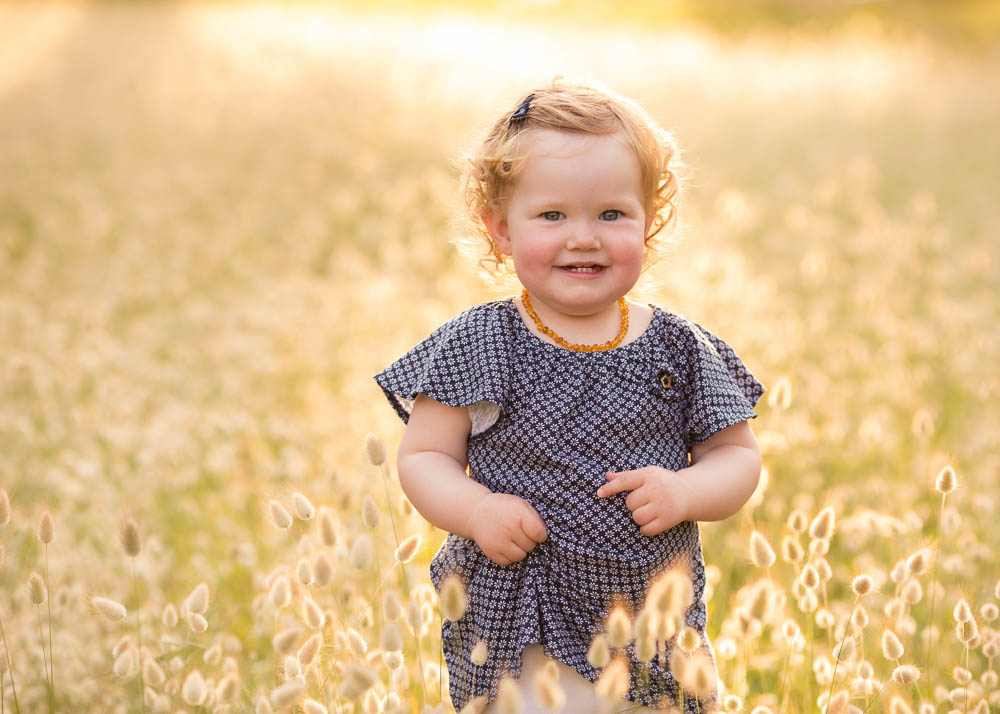
[toddler image montage]

Let me let you in on my . . .

TOP 5 TIPS for photographing toddlers


One | Be silly

Leave your inhibitions behind and be silly.  If you want to photograph a natural smile from a toddler, then you have to make them laugh.  End of story.  Some of the classics are being an animal, playing peekaboo, clucking like a chicken, you get the picture.  The great thing about toddlers is they don’t get bored, so once you hit the sweet spot and crack a giggle, they’ll likely keep right on laughing!

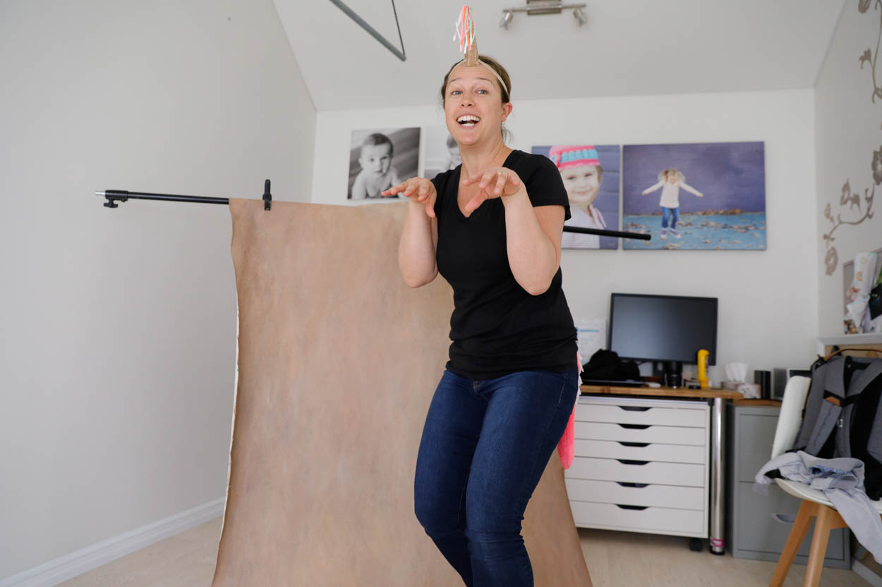
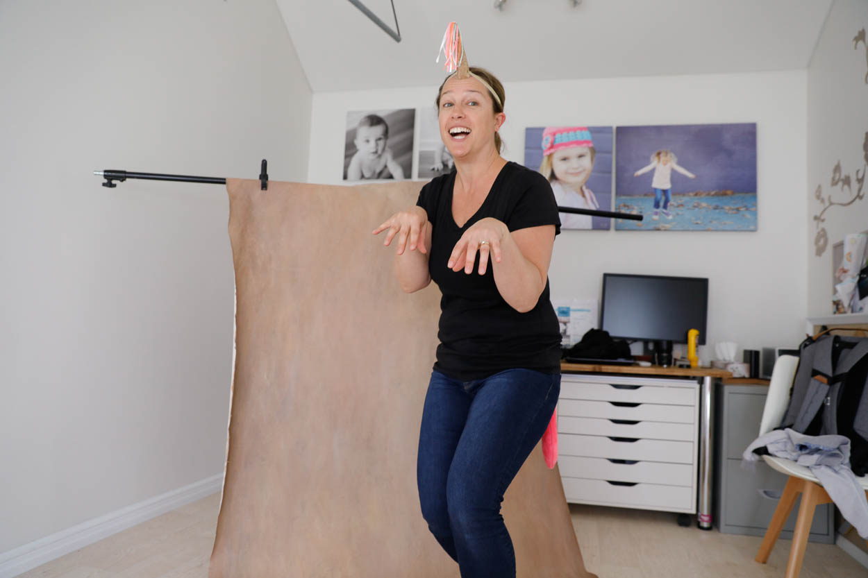
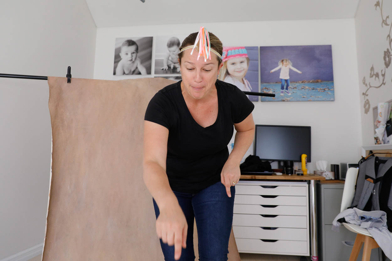
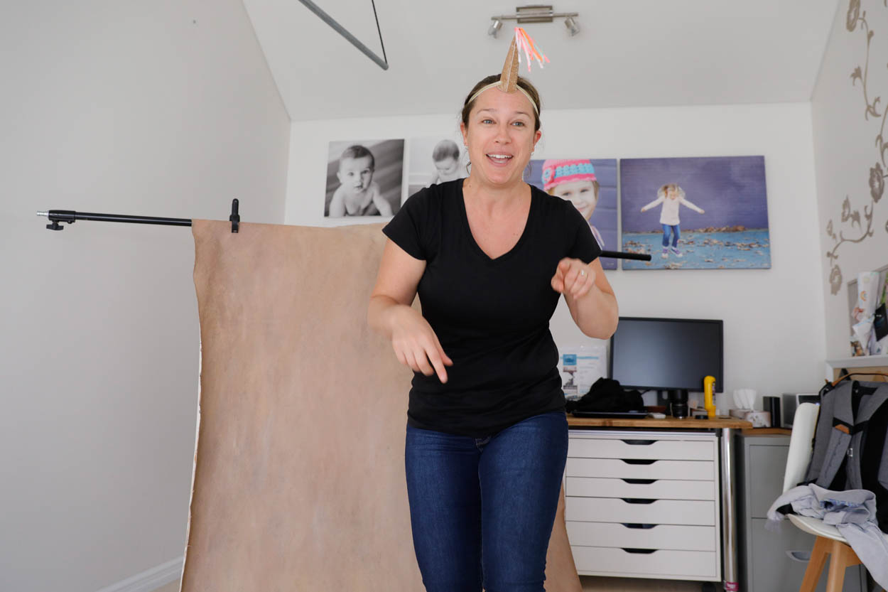
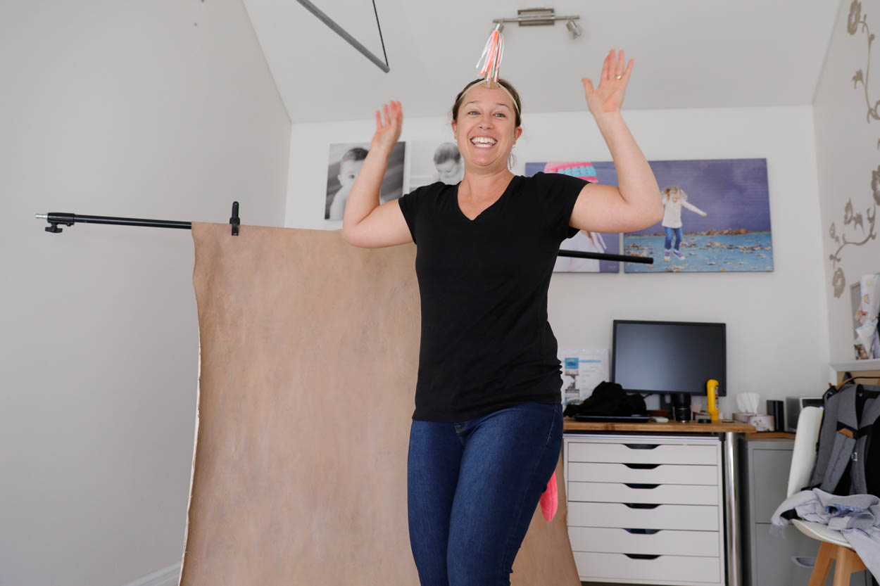
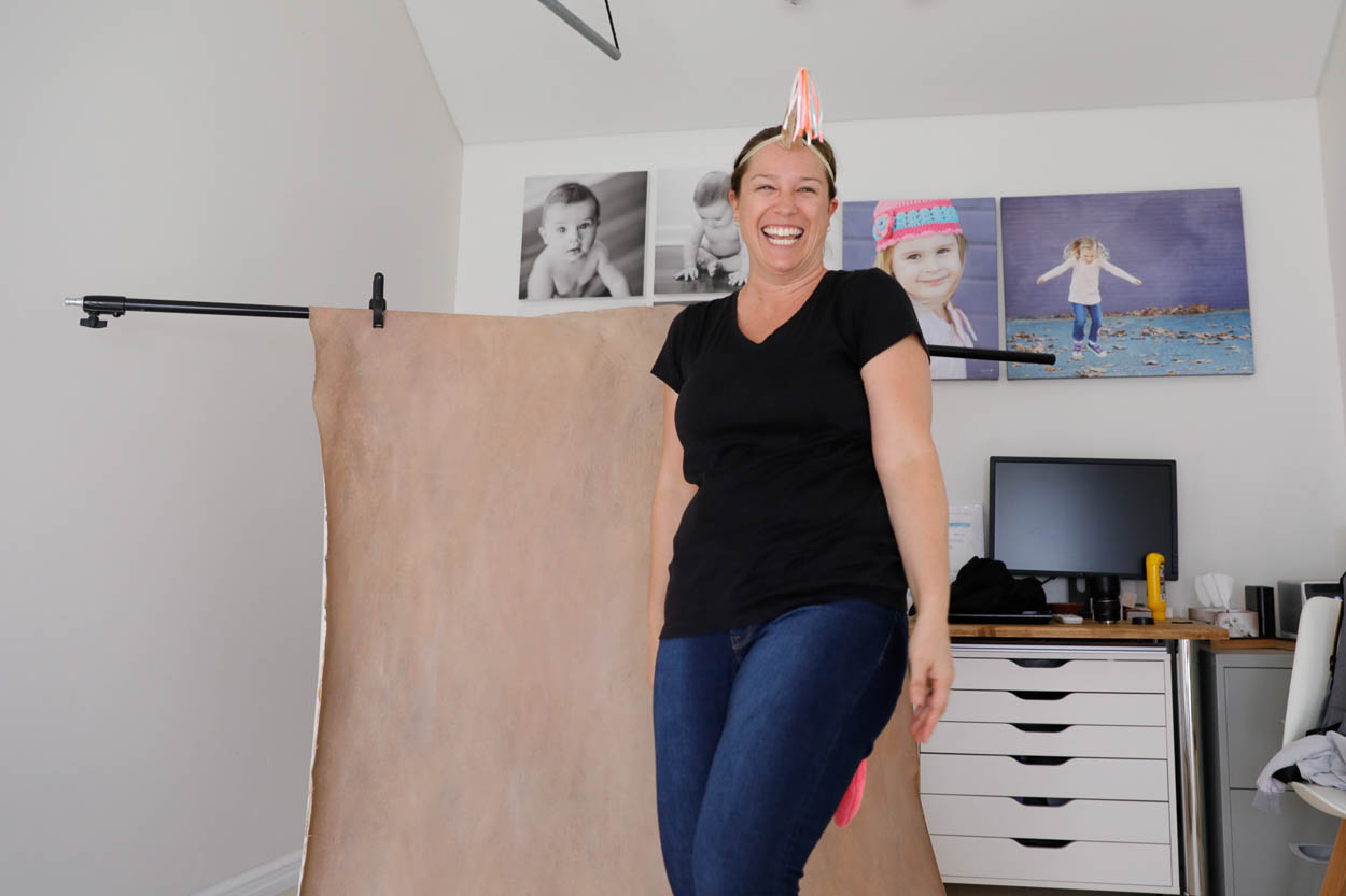
Is there any length I won’t go to when photographing toddlers??  Very few apparently as these picture show, one reluctant toddler insisted I dress & be like a unicorn while she took some pictures before she would have a turn in front of the camera.  Sounds pretty fair to me. She didn’t do a bad job of the photos either!

Very few apparently  . . . as these picture show! The toddler at this session was relucent to be photographed, not uncommon.  She insisted I dress & be like a unicorn while she took some pictures of me before she would have a turn in front of the camera.  Sounds pretty fair to me. She didn’t do a bad job of the photos either!


Two | Include their special toy

My favourite toddler photo idea is to include their special toy!

Since my little guy was around 5 months old, he’s been attached to his bunny.  Bunny is so important that at one time we had 3 bunnies, just in case one was lost.  We even made sure they were all used on rotation so the wear and tear was even between them all! He won’t sleep with out bunny and would pretty much take him everywhere if we didn’t ban bunny from leaving the house –  there was a traumatic supermarket visit, where bunny 3 went missing, and frankly, we’re all still scarred!

But I digress, rather than fight your toddlers need to have their favourite toy around.  Work with it, I love the images of my boy when he was a toddler with bunny, he was and is such a big part of our household that he deserves to be photographed too. We are photographing our families memories and these toys are one of the biggest childhood memories.  As a bonus, your toddler will be more relaxed, a touch more coorporative and often just a tiny bit still for a few moments.


Three | Make it about play and games

Picture this, you’re standing in front of a toddler with your camera over your face and you say;

Look at me, look this way, smile, smile for the camera

And your toddler obligingly stands there and gives you the most beatific smile to boot . . .

Ha ha ha ha – ermm, nope. They will most like turn around, run away, look at their feet, cry, frown, cling to your leg or Mum’s leg . . . anything but look a the camera.

What if you said this instead;

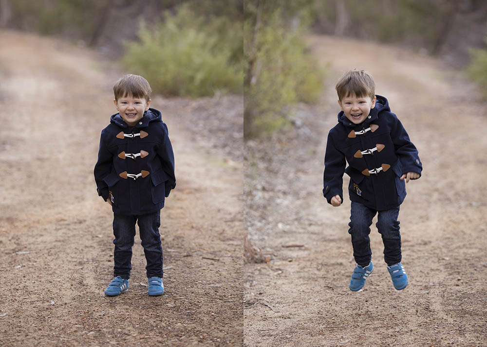
Now let’s stand on this magic spot (a leaf, a mark in the path, anything) and I’m going to count to three and then let’s see how high you can jump, I bet you’re pretty good at jumping, you look like you’re a super star jumper.!  Now are you ready?

One.  Two. Three.

Jump!

And they stand there giggling why you count (you take gorgeous giggling shots of your toddler) then they jump (and you take some more gorgeous toddler photographs)

Can you see how that works 🙂

Make it a game.  Play with them.


Four | Get their feet off the ground

Okay, so toddlers are busy.  Very very busy. You’re not going to get them standing still for very long no matter how amazing the game is.  And photographing toddlers on the move and being busy is a great idea, but sometimes we want that gorgeous headshot with the sweet smile to go along with the “action” shot.  How do you get them to pause?

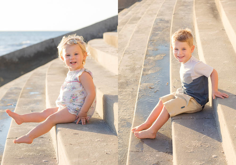
It might sound odd, but if you can get their feet off the ground then you’ll almost always have a small window to photograph a gorgeous toddler portrait.  Sit on a chair, stand on a log or bench, maybe you have a ride on toy that you can crop out of the frame . . . be inventive and look for a safe place to temporarily imprison your toddler 😉  I joke, but really – it works!

Just be quick, it won’t take them long to realise they can move 🙂


Five | Be prepared

That leads me perfectly into my final tip for photographing toddlers.

Be prepared!  Have your camera ready to go.  Don’t fluff around with settings. Don’t realise you should have moved the wash basket from the shot.  You almost never get a do-over with toddler photography.

Make sure the light is good, your exposure is right, check for clutter and then get the toddler in the shot.  The more confident you get with photography the quicker you’ll get at being ready and the more shots you’ll be able to capture.


These 5 Tips for photographing your toddler should help you get that winning shot without losing your cool.

Which one do you think will help you the most?