Behind the Scenes | How to take a creative award winning family portrait
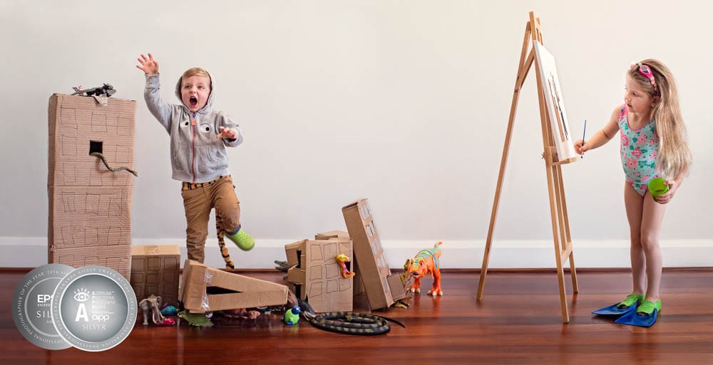
This gorgeous image was taken as one of my whimsical portrait sessions. Where I work with the clients to take one amazing hero shot of their kids that really showcases their personality. Whimsical sessions are great fun and result in a quirky personalised art piece for the family home. This image won a solid silver award at both the recent 2016 National Australian Professional Photography Awards (APPAs) and the WA professional photography awards. Here’s the inside scoop on how I set up and captured this image.
Planning
For these stylised sessions I ask a lot of questions about the kids, what they love, what they are in to, colours, foods, habits etc and brainstorm various ideas for a set up. In this instance, the older swimming loving sister who also loves to draw was painting a picture of her little brother, lover of small dinosaur and animal toys with the usual destructive nature.
Time of Day & Location notes
As this was taken indoors, the time of day didn’t matter. It was around 11am, and we cleared a wall in the kitchen by moving a table. There was a bank of windows to the right, and a smaller set directly behind me. The scene was actually taken as two images. The boy then the girl, and joined together in PS. This was bot for reasons of space, and because it’s easier to get the exact individual expressions when capturing just one subject.
Setting the scene
The little boy wasn’t feeling great at our session, he’d been sick for a few days. I made sure the entire scene was set up ready to go, the lighting was right and the camera set on a tripod before encouraging him into the shot. This way, no time or good humour was wasted getting things right, all he had to some come in and play. Be a dinosour and smash up the city. His older sister was easy, happy to do what ever we asked. However I still made sure everything was ready for her.
The tech stuff
Shot using natural light, I set the camera on a tripod so that if I had to make any composites it would be an easy swap. Also the tripod allowed me to not hide behind the camera which allowed better engagement with the subjects. I used my 35mm 1.2L lens, at f4 – I wanted depth of field here.
Editing
Editing this award winning image was a matter of combing the two final images. A lot of work had to be done to make sure the floor aligned as well as the skirting boards and blended so that no join could be seen. I also removed distracting elements like power points and a small window. A few marks on the walls were cloned off. The final image was then given a slight HDR look with a heavy tonal contrast in PS. This gave the image and ever so slight cartoon look that I really think helped to set off the image!


Facebook Comments