Lightroom Classic CC Clean Edit – Start to Finish
What is a “clean edit”?
“Clean Edit” is a term you hear a lot in photography circles, thankfully we aren’t talking about household chores, you can do a clean edit when your desk is in a complete shambles, just as you can clean edit a picture of your kids bedroom/rubbish tip! A clean edit simply means, editing the image so that it looks pretty much how your eyes saw it when you took the photo. No extra filters or funky colour effects and keeping the image relatively true to life. Perfect for child photography!
As you grow in your photography journey you might find yourself at times drawn to a particular style, like matt finish, B&W, vivid colour or even grunge. Particular editing styles go in and out of fashion and while fun, keep in mind that you can end up dating your photos if effects are used with too heavy a hand. I find most of the time a clean edit produces the most timeless effect, one that doesn’t have me cringing in years to come!
Let’s jump in and get started!
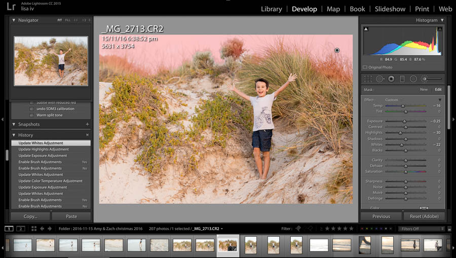
I’ve chosen this image of my son on a sand dune, it was taken just before sunset – on a fizzer of a sunset day – so colour in the sky was pretty non-existent. I could do a funky edit and “fake” an amazing sunset, but then this wouldn’t be a “clean edit” tutorial, yes?
When editing in Lightroom, I always work through the tool palates from top to bottom. Not only is it a nice logical workflow, it produces great results.
Step 1 | Crop & straighten
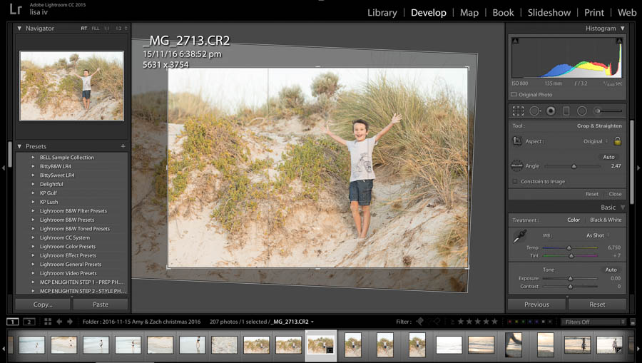
First up, I like to crop and straighten the image. I don’t know about you, but I can never take a straight image!
Because this image has sand dunes of a horizon it’s not so bad, but I still grab the crop tool and then the ruler and make a slight adjustment. Then crop in a little using the “rule of thirds guides” so that the composition feels better.
Step 2 | Basic edits / global adjustments
Next up is the basics panel, and again I work through this panel from top to bottom.
White balance
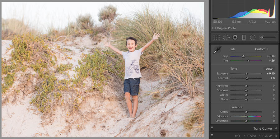
You can get very strict with white balance, using all sorts of measurement tools and scientific formula’s if you want to. But who has that kind of time? Even with a clean edit, it’s ok to interpret the image to suit your preferences making it slightly warmer or cooler than “strictly” accurate on the day. I usually start with auto or as shot, then choose my preference, my tastes generally run to a little warmer.
Straight out of camera this image felt a little green and cool, so I’ve bumped the temp and tint up a touch.
Exposure
The image is quite bright, but a beach is! So I’ve only brought it down just a smidge.
Contrast
I don’t like to add a lot of contrast with this slider, and sometimes I don’t even use it. More subtle and targeted contrast can be achieved with the next section. In this image, I go for +8.
Highlights / shadows / whites / blacks
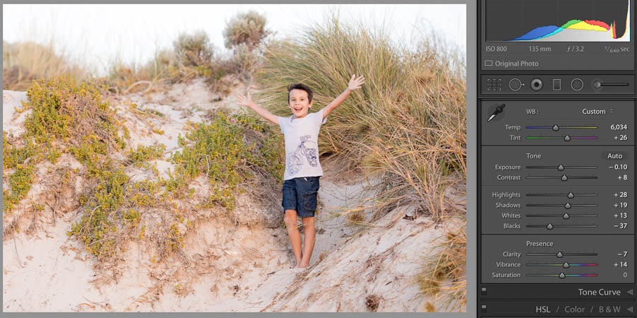
When adjusting these you need to look at your image analytically, ask yourself, do the lightest parts look to bright? The darkest to black and lacking in detail? Overall is it a little flat, with no real highlight or shadow? And adjust accordingly. This shot, is a little flat, with no real highlights or shadows and could do with a little more punch.
I bring the highlights down -28 to give a bit more definition to the sky and the grasses. Shadows to -19 and whites up to +13 and the blacks to -37 a fair amount to really add that punch.
Clarity
I reduce the clarity a little to slightly take the edge of the grasses and increased the vibrance a touch.
Tone curve
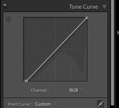
I’ve slightly darkened the shadows by bringing the bottom left across a fraction.
For beginners, we can skip over the HSL/Colour/B&W, and split toning panels.
Step 3 | Sharpen
In the detail panel, zoomed into 100% I move the amount up to 43. I can’t see any noise or other issues so leave the rest as it is.
Step 4 | Advanced / local Adjustments
Now I jump down to the effects panel.
Vignette
Often I’ll add a very subtle, soft edged vignette to an image, to draw your eye to the subject. This image, however, works better with out a vignette so I’ve left this alone.
Remove an object
Just because it’s a clean edit, it doesn’t mean you can’t clean it up a little. I’m not in love with the cuttle fish on the sand – it looks more like rubbish – so I’ve removed it using the spot removal tool.
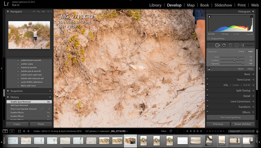

Selective dodge or burn
Lastly, I look to see if any parts of the image could do with a selective lightening or darkening. Often the sky can needs to be darkened a little to reflect the colour on the day – unfortunately because the sunset was a real fizzer on this day, there’s not much that can be done with this sky so I just pull it back a little with the brush tool.
Lastly – I always take a look at the image and see if there is anything I want to change or tweak now I’ve finished all my edits. Remember when editing less is more! It’s really easy to go to far and end up with a weird pop art looking number.
And that’s it! Here’s the before and after with a clean Lightroom edit.
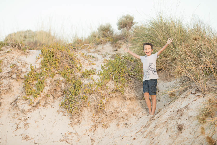
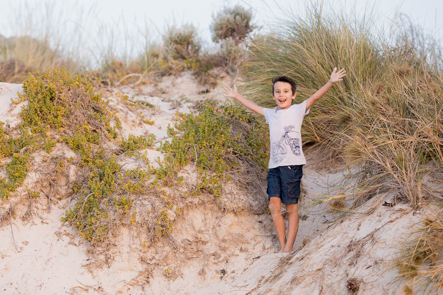
Some of the links in this post are affiliate links, however, be assured I only ever recommend products or services I personally use and love.




Facebook Comments